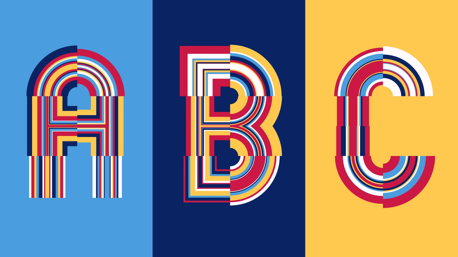
As a Digital Designer at IN10 I’m blessed to work with various established visual identities. One of those is the visual identity of the Museum Boijmans van Beuningen. This visual identity is designed by Armand Mevis and Linda Van Deursen and is heavily inspired by the typeface of the Mexico Olympics of 1986 (designed by Lance Wyman).
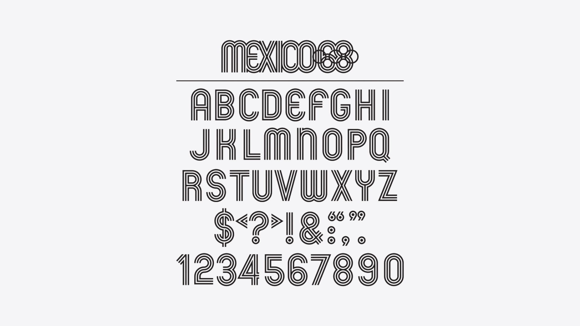 Mexico Olympics Typeface by Lance Wyman, 1966
The Mexico Olympics typeface is based on the geometry of the Olympic rings and inspired by multiline patterns found in Mexican art. I really liked how this typeface was constructed. With a quick glance you can see that most characters are drawn with just a few geometric shapes. I gave myself a challenge to see if I could recreate this typeface by using code and iterate on its design from there.
Deconstruct
Before I could start programming I deconstructed the Mexico Olympics typeface. Looking at the characters I noticed that most characters could be drawn with arcs, corners and lines. Grid wise it seemed that most characters used a 2x4 grid of tiles where each tile could hold one of the graphics described previously. A couple of ‘special’ characters like the M, W, Z & V needed another approach because these characters used different shapes and grids. I started with the basics.
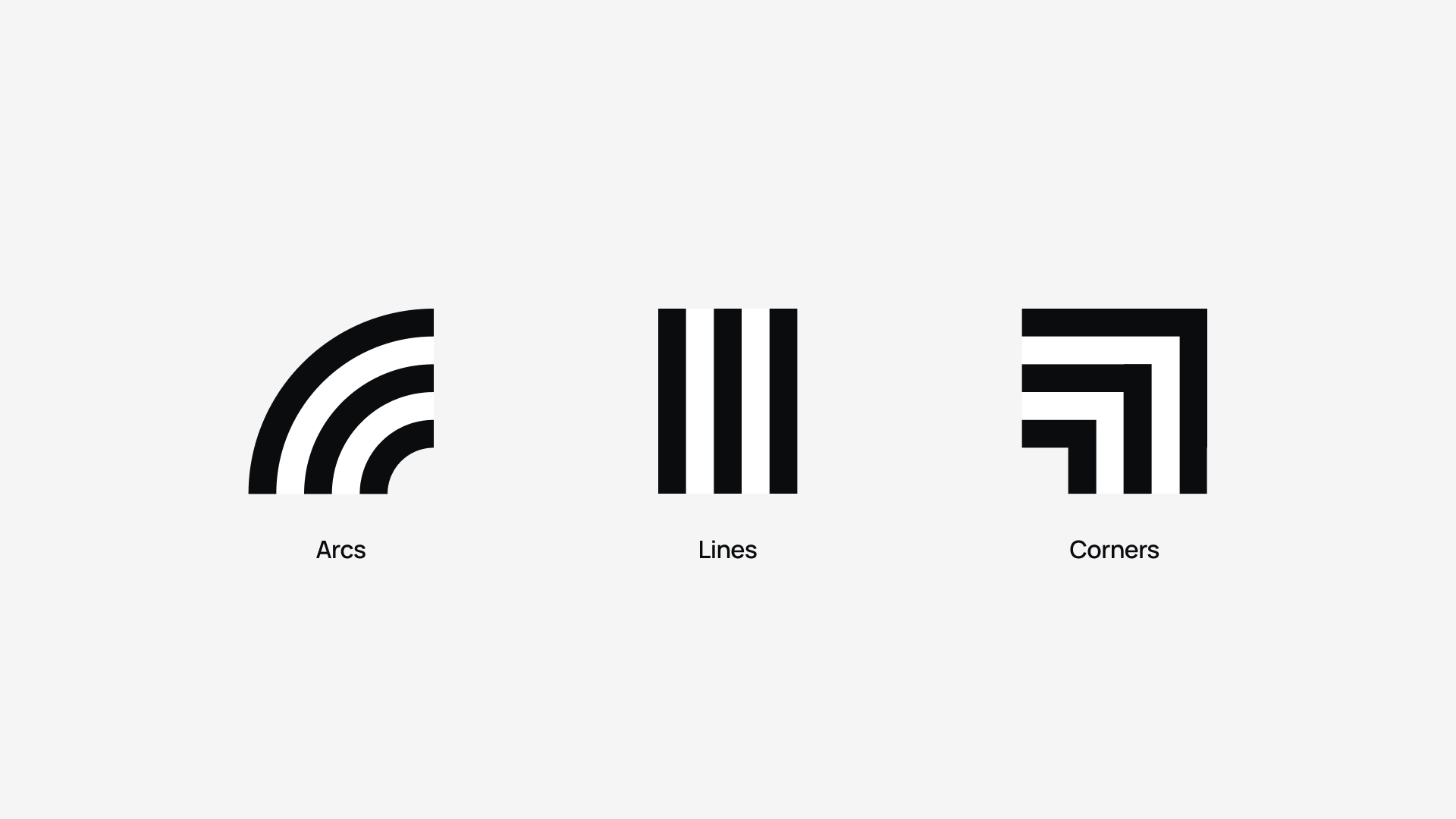 Base graphical elements for the construction of most of the characters
Drawing characters
Knowing how I could draw most characters it was time to start programming. I started with making the graphical elements. Each character uses its own set of graphical elements. The letter A for example uses two opposing arcs that form a half circle at the top two columns, two straight corners on the second row of columns and four straight lines for the last two rows.
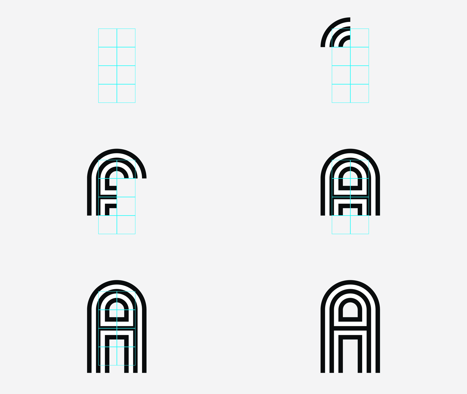 Construction of the character A
Pretty quickly I could generate characters but it was a tedious job to create a custom drawing function for each characters. To fix this I created a command string for each character that held instructions for choosing the type of graphics, the orientation and a possible overshoot (some letters needed to have an extra length at the end of their graphical shapes). The command strings looked something like this:
String characterA = "ATL,ATR,TBL,E,E,TTR,LLEOE,LREOS";
String characterB = "CTL,ATR,TBL,E,E,DTR,CBL,ABR";
String characterC = "ATL,ATR,LLE,E,LLE,E,ABL,ABR";
Code example of a helper function that returns a random integer
I wrote an interpreter that could draw a character based on the above command strings. Roughly translated the command string for the character A says:
- ATL = Type: Arc / Orientation: Top Left
- ATR = Type: Arc / Orientation: Top Right
- TBL = Type: T-Junction / Orientation: Bottom Left
- E = Empty
- E = Empty
- TTR = Type: T-Junction / Orientation: Top Right
- LLEOE = Type: Line / Orientation: Left / Overshot: Overshoot End
- LREOS = Type: Line / Orientation: Right / Overshoot: Overshoot Start
With this approach I immediately sped up my proces so I could focus on iterating further on its design. For ‘special’ characters like the M, W, Z and V I came up with a similar but more custom approac.
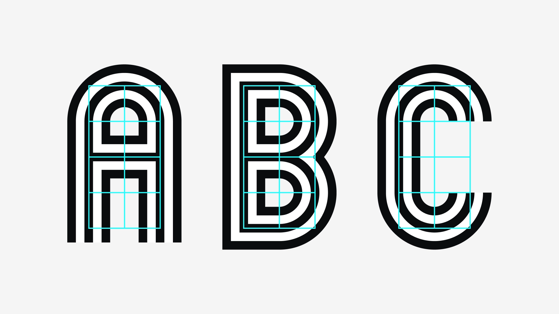 Generated characters: A, B & C
Iterating / Experimenting
Having a basic algorithm for drawing all characters I could start exploring various visual directions. During this process I come up with questions/ideas like:
- What result do you get if characters are drawn with multiple lines instead of the original three?
- What happens if I use different stroke weight?
- What effect do you get when you alter the scaling of the graphic elements?
I implement these ideas along the way when I’m working on the algorithm. Sometimes I need to alter or add functionality to the algorithm but it could also take only a change in a single parameter. See below for a couple of experiments I did.
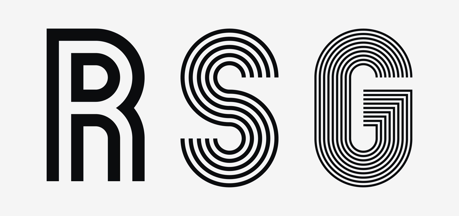 Experiment where characters are build with varying line amounts
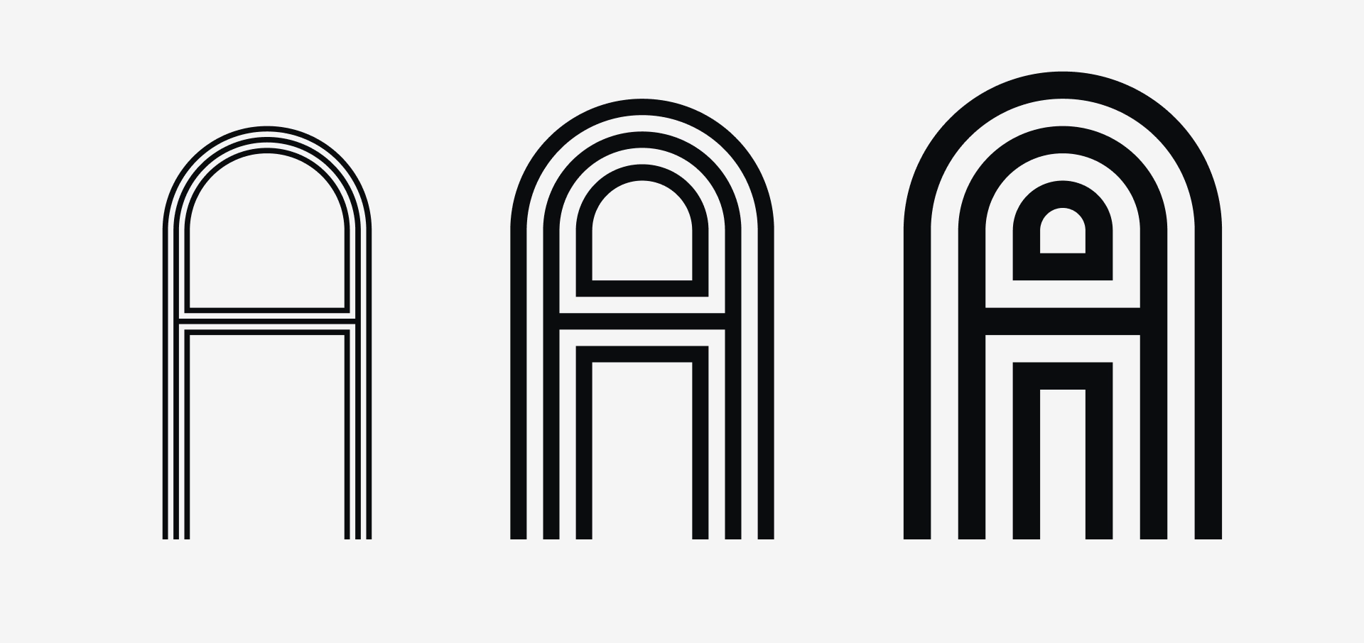 Experiment of characters with different weights
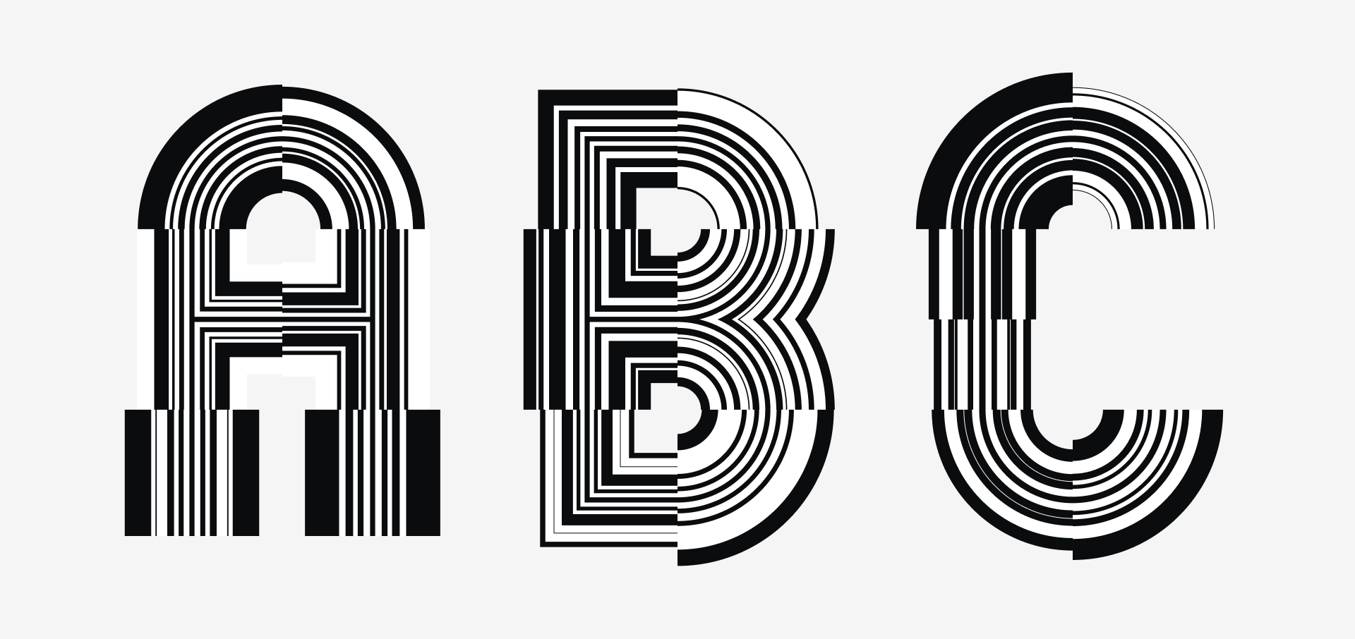 Experiment of characters with random stroke weights in many places
Finishing up
After exploring several visual directions I ended up with a variant where each character is generated differently due to the influence of random stroke weights and coloring. This gives an almost 3D or collage like feel to it.
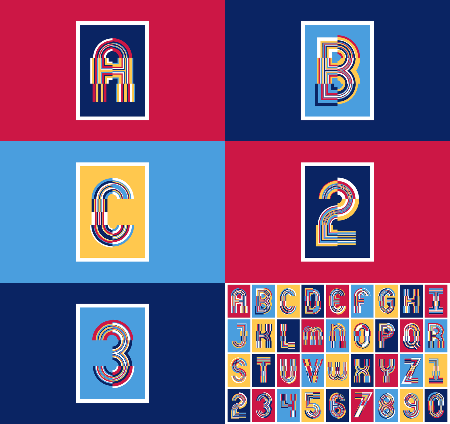 Misha.studio - Algorithm: Mexico (Various editions)
Get your editon
Choose your letter or number, add your personal input and get your unique edition of this algorithm via my shop.
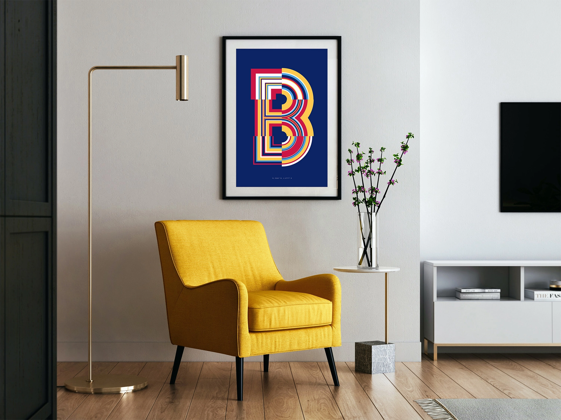
I hope this post gave you some insight in how I create my artwork. In this case I started by trying to recreate an existing piece of art / typeface and used that as a basis to create something different with still a resemblance to its inspiration.
If you have any questions or remarks please let me know via e-mail or via DM ;)

